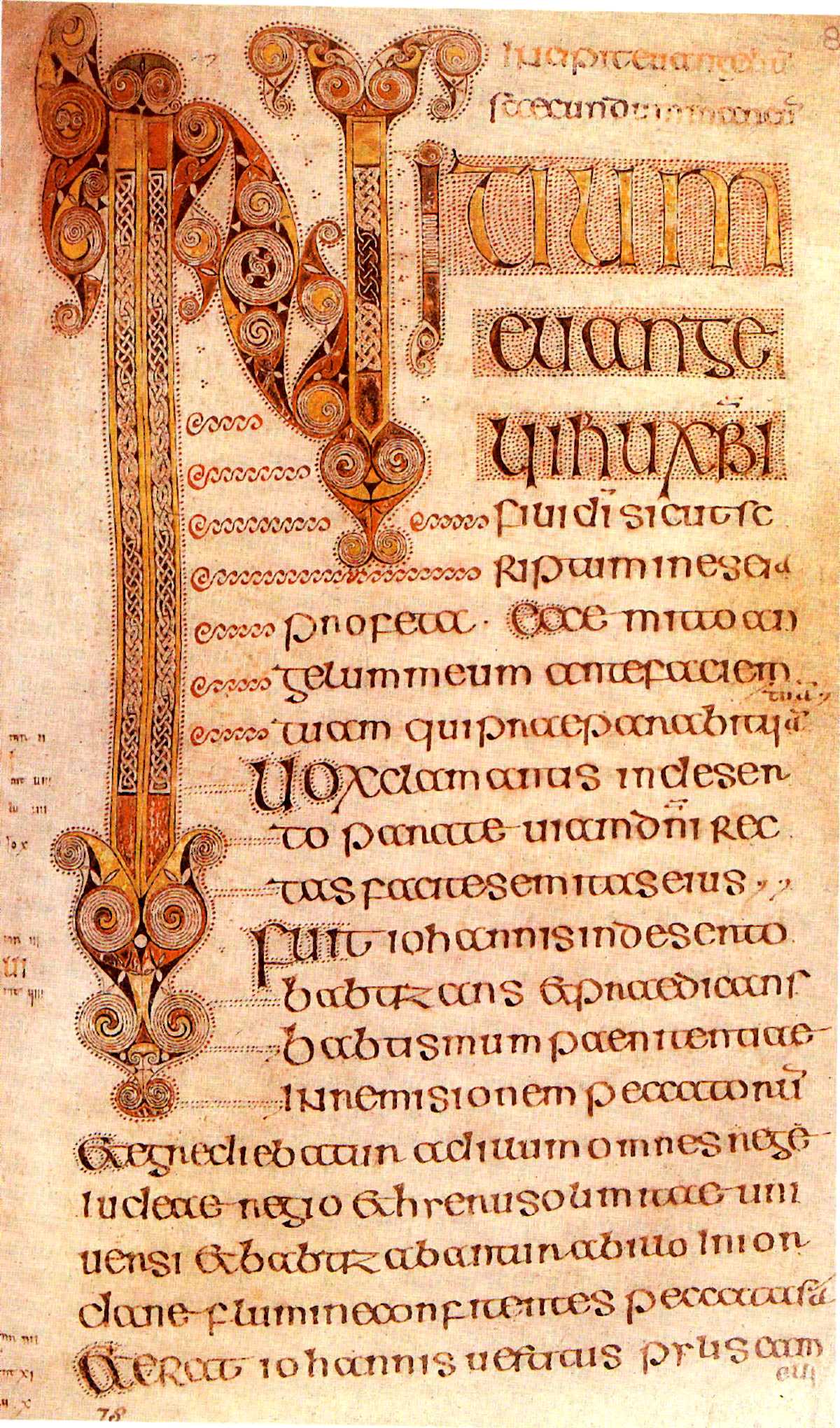
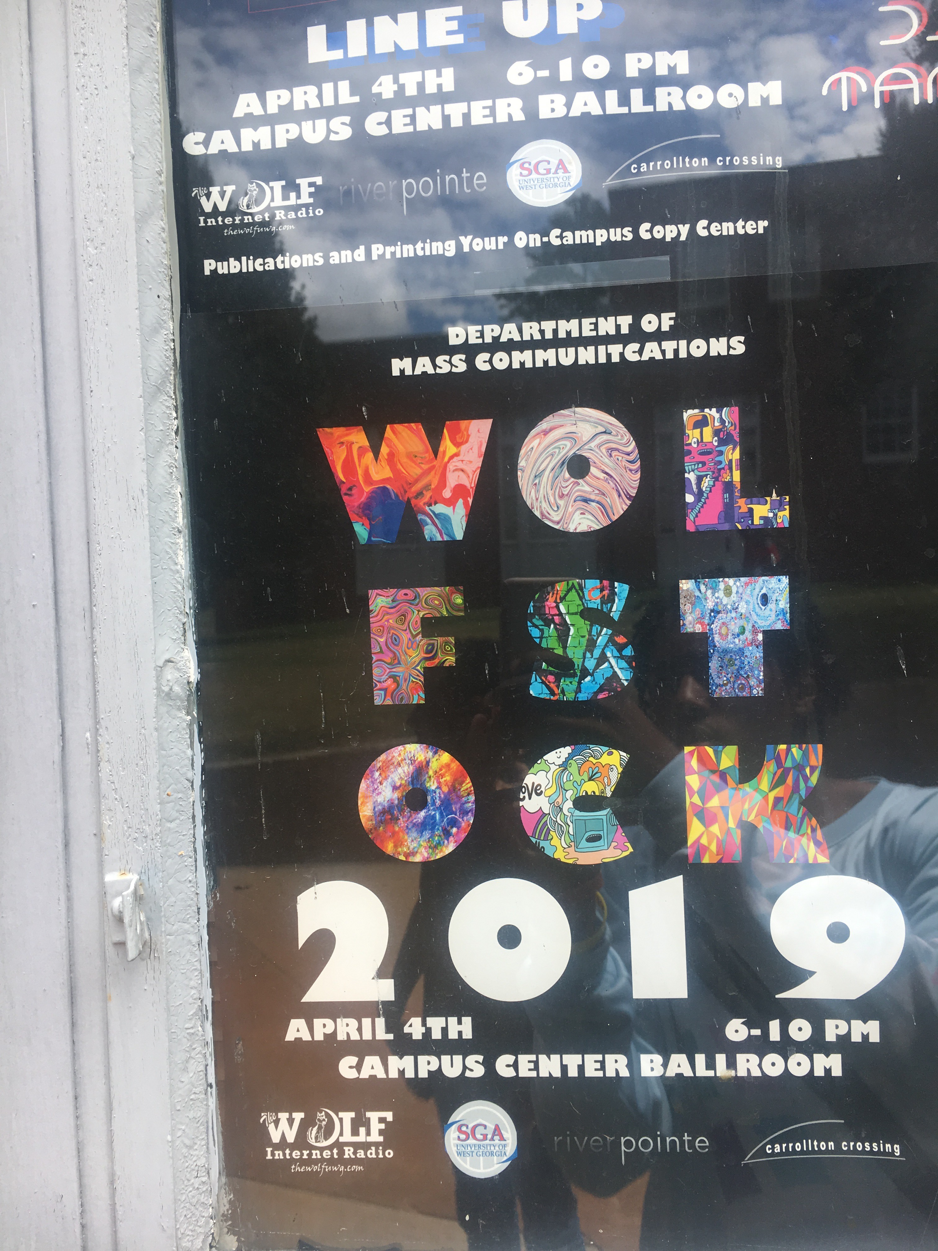
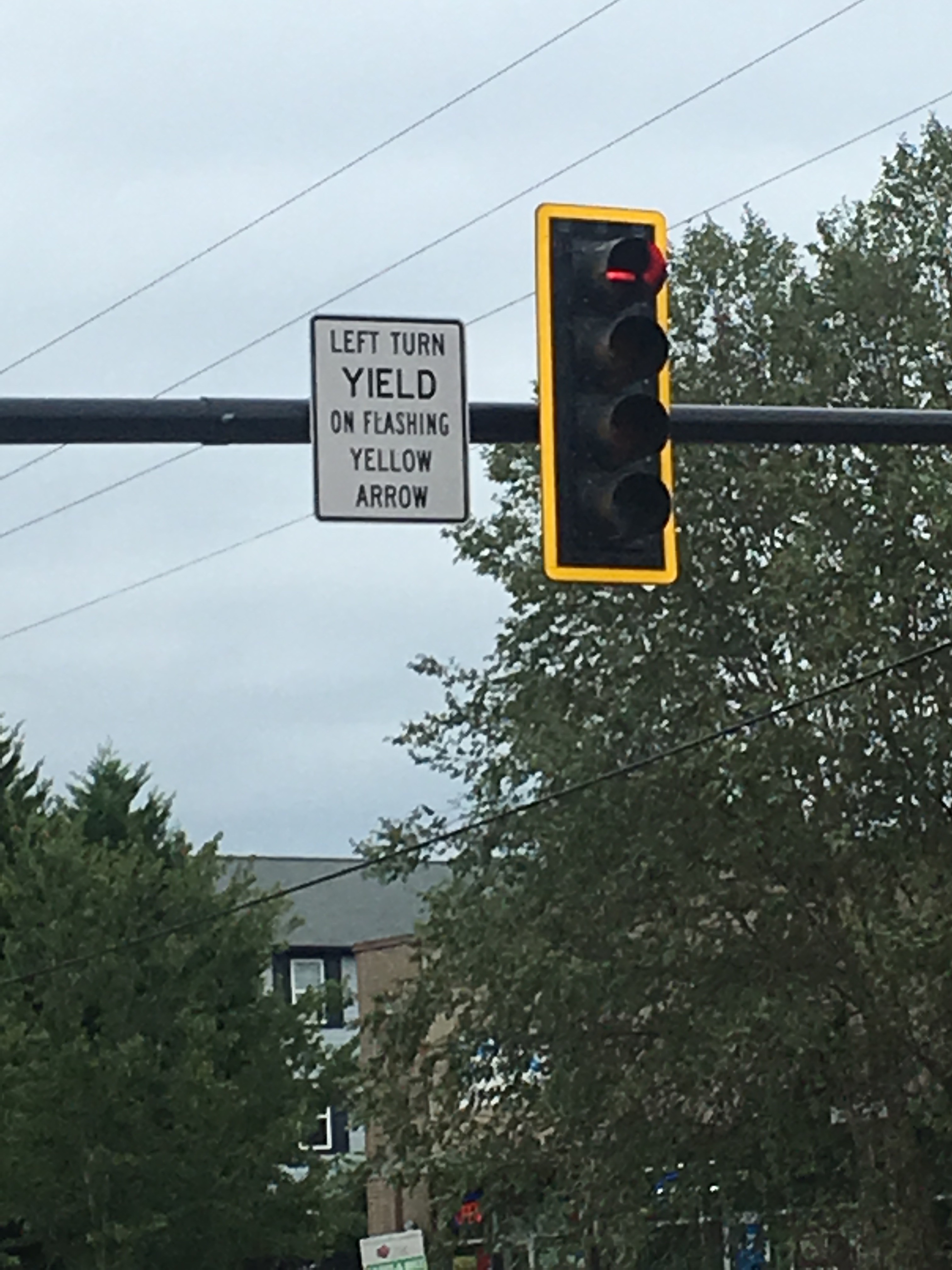
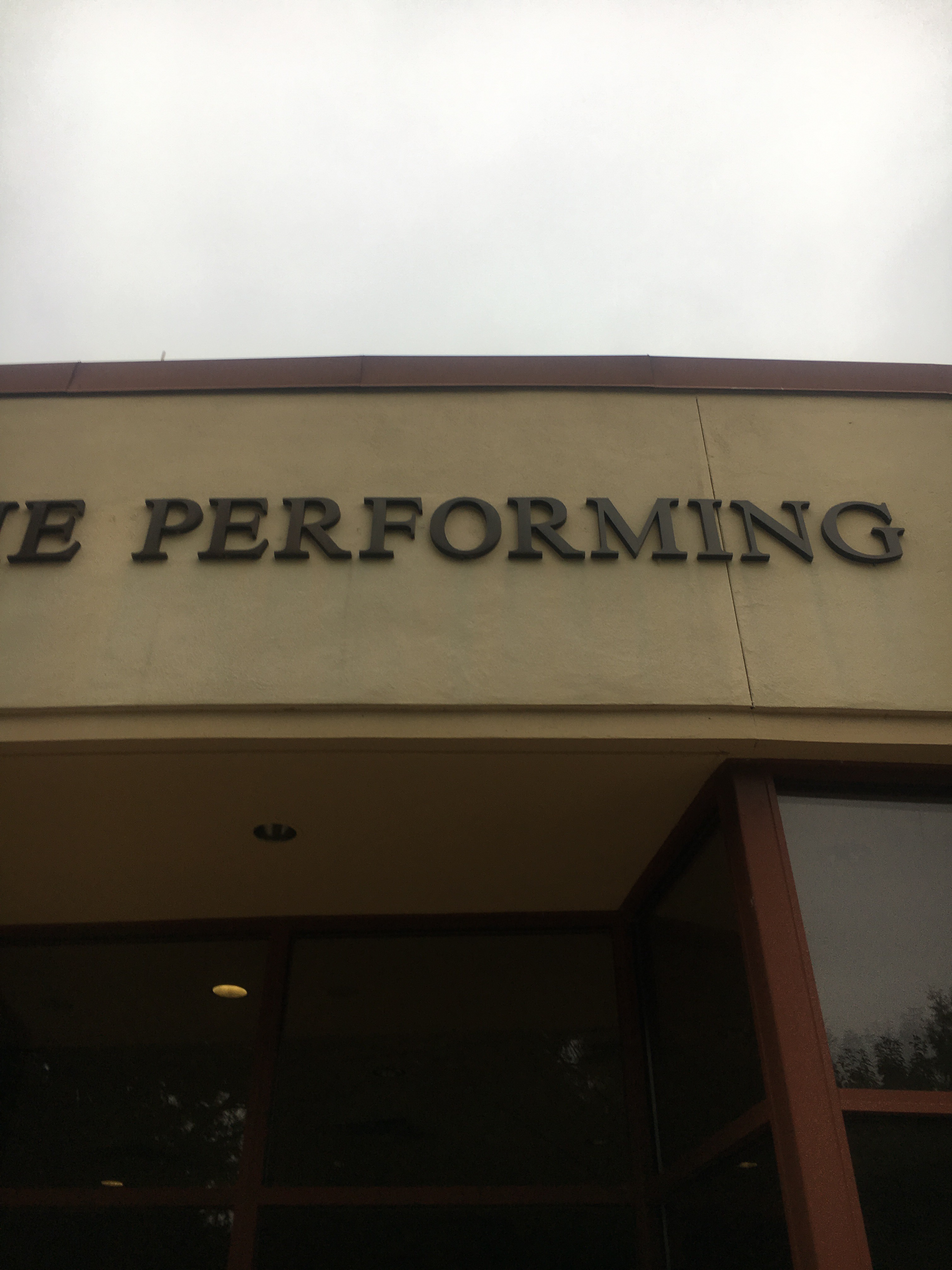
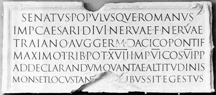
For my 1st blog I decided to choose things that I see everyday In my life on West Georgia’s campus that I could relate to what we are studying in class. I was able to find a few things such as the type above our Theatre building, An advertisement for the Department of Mass Communications and a yield sign on a stoplight right out side of West Georgia’s campus. I choose these three different things and are interested in them because the advertisement and the yield sign reminded me the most of the book of Durrow which was the first time that a descending font size was introduced in books and writing. I feel as though the yield sign shows a good example of this by putting emphasis on ‘Yield’ and reducing the size as it continues down. The advertisement utilizes the reduction of size but in a different way because instead of it descending the size it is decreasing it as your eyes travel up the page. I Also chose the Theatre buildings font because it reminded me the most of Roman square capitals, and the font being used resembles Times New Roman and if it is not, it is definitely a serif based font. The use of this font is definitely fitting since the building is for the performing arts so it gives it a very classical and respectful look.
- Comment
- Reblog
-
Subscribe
Subscribed
Have a WordPress.com account? Log in now.

