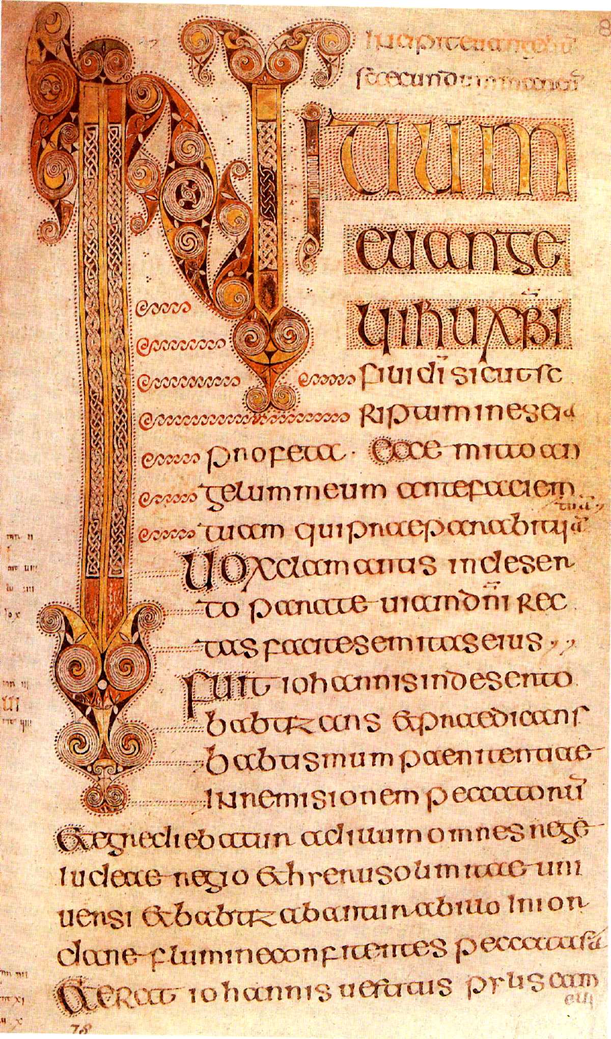
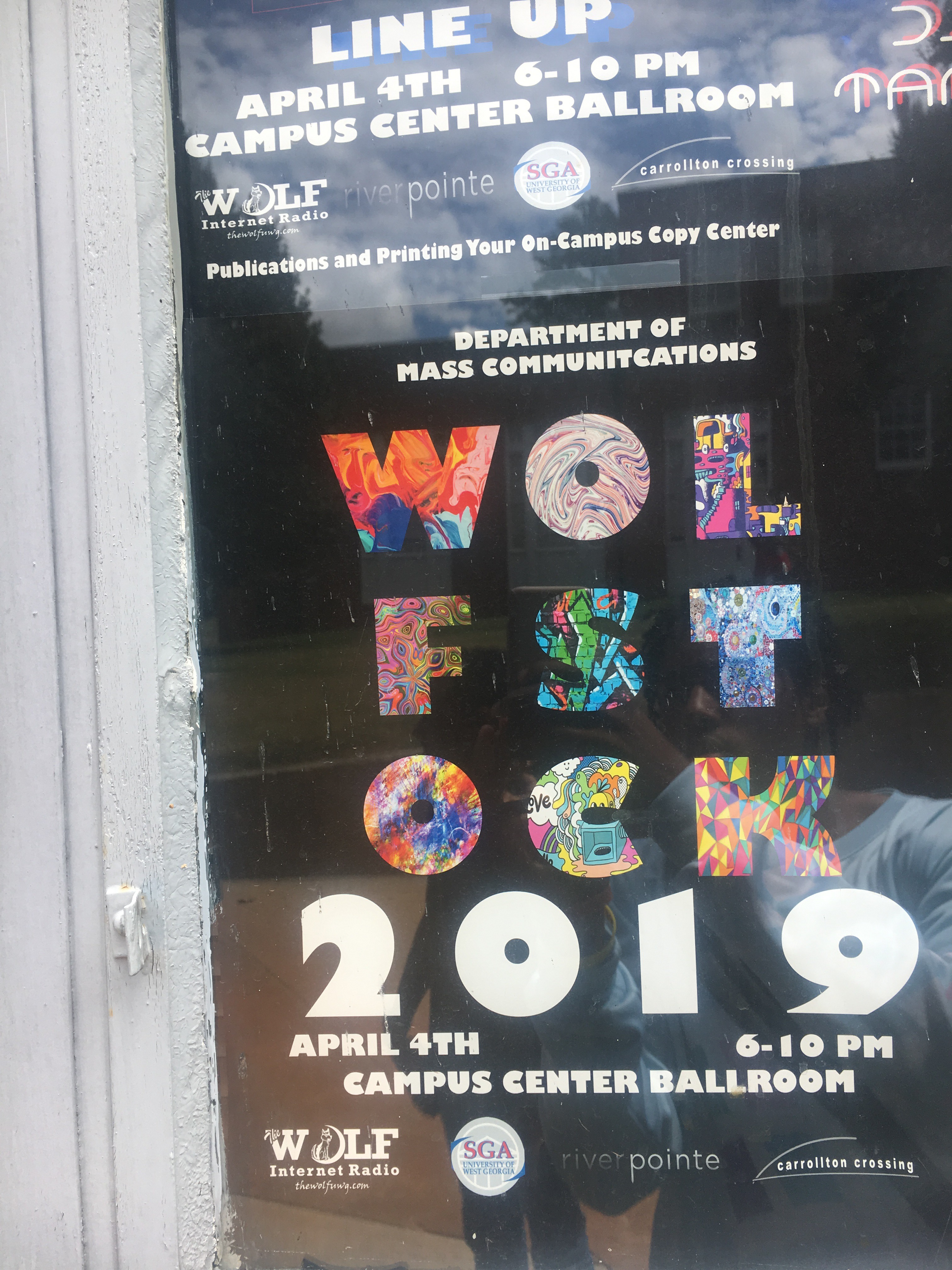
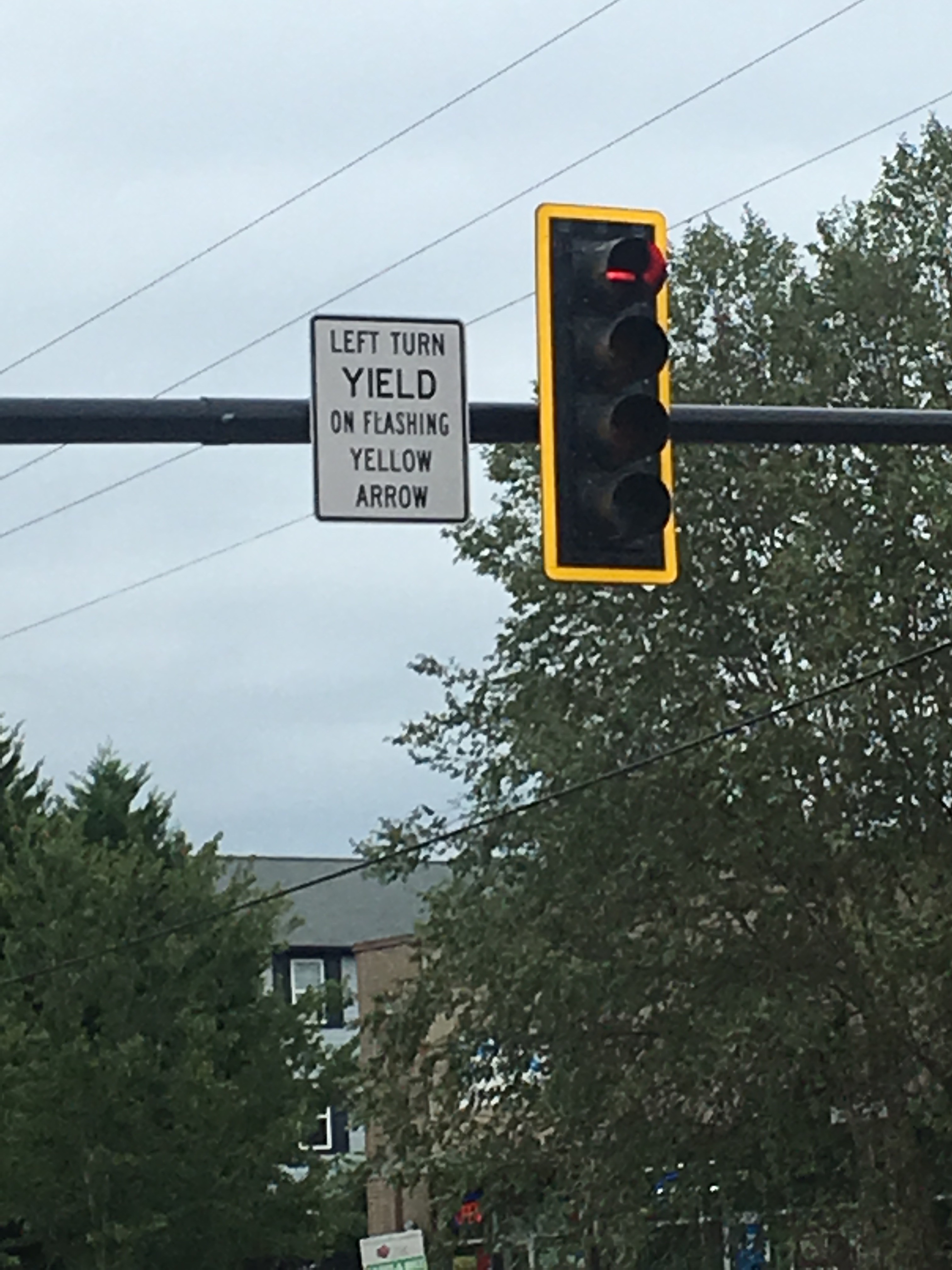
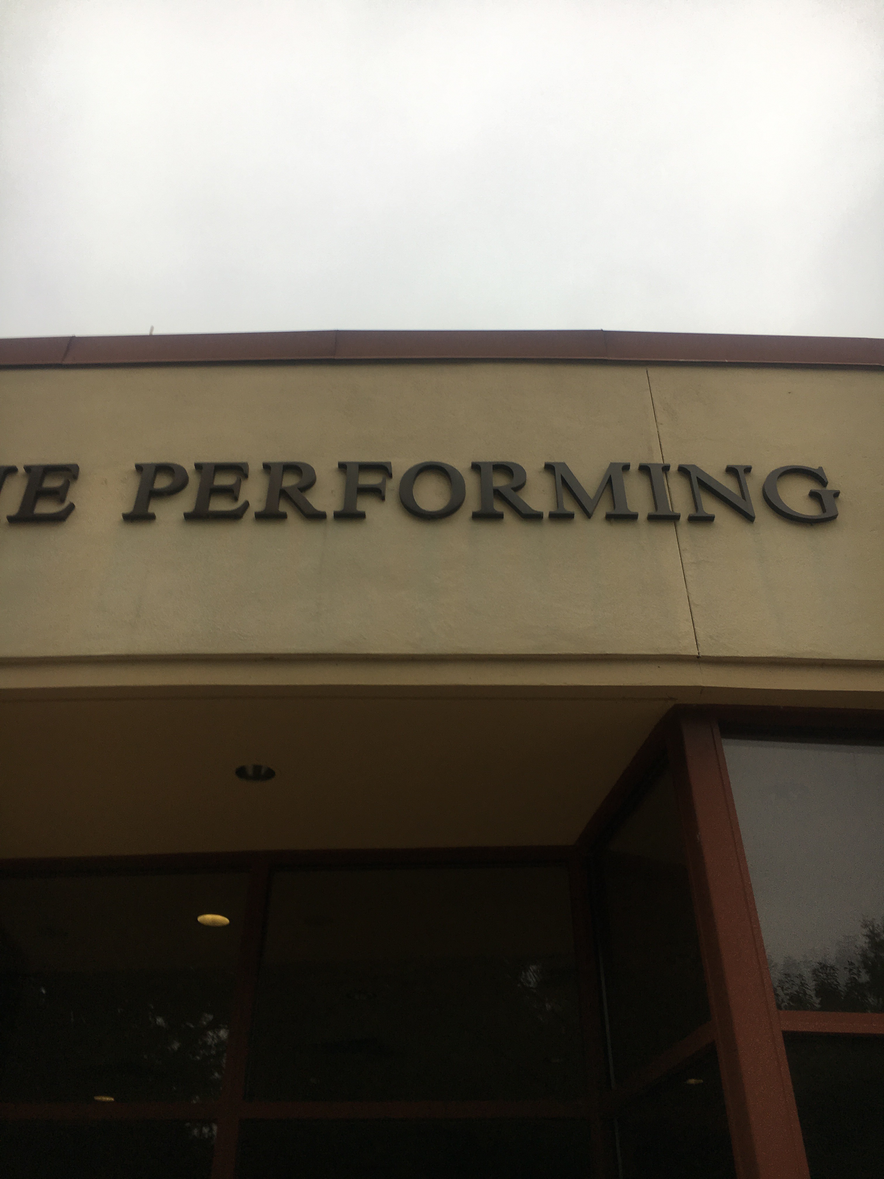
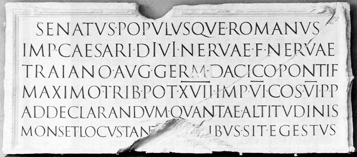
For my 1st blog I decided to choose things that I see everyday In my life on West Georgia’s campus that I could relate to what we are studying in class. I was able to find a few things such as the type above our Theatre building, An advertisement for the Department of Mass Communications and a yield sign on a stoplight right out side of West Georgia’s campus. I choose these three different things and are interested in them because the advertisement and the yield sign reminded me the most of the book of Durrow which was the first time that a descending font size was introduced in books and writing. I feel as though the yield sign shows a good example of this by putting emphasis on ‘Yield’ and reducing the size as it continues down. The advertisement utilizes the reduction of size but in a different way because instead of it descending the size it is decreasing it as your eyes travel up the page. I Also chose the Theatre buildings font because it reminded me the most of Roman square capitals, and the font being used resembles Times New Roman and if it is not, it is definitely a serif based font. The use of this font is definitely fitting since the building is for the performing arts so it gives it a very classical and respectful look.
1st Blog Post; Graphic Design II
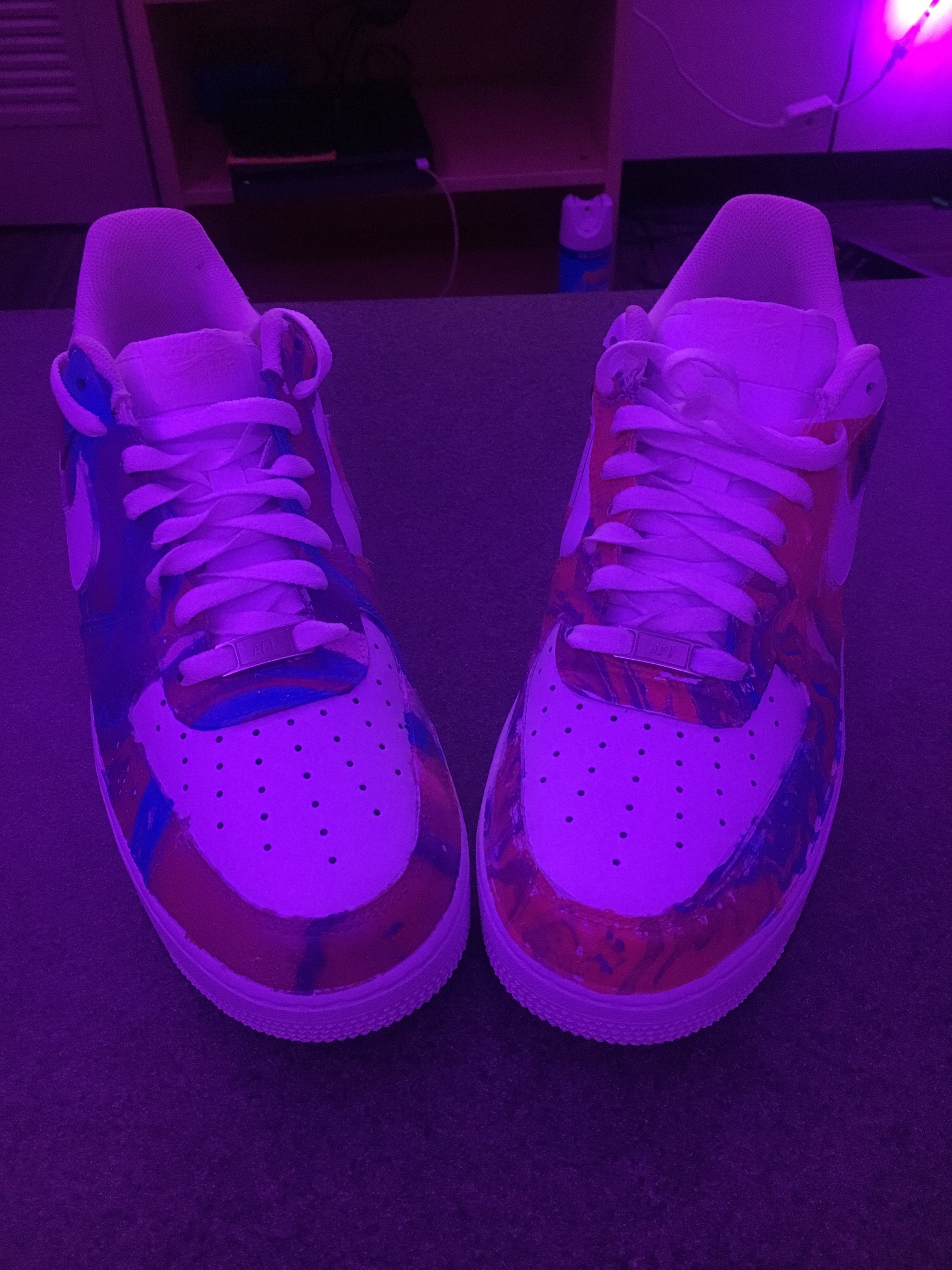
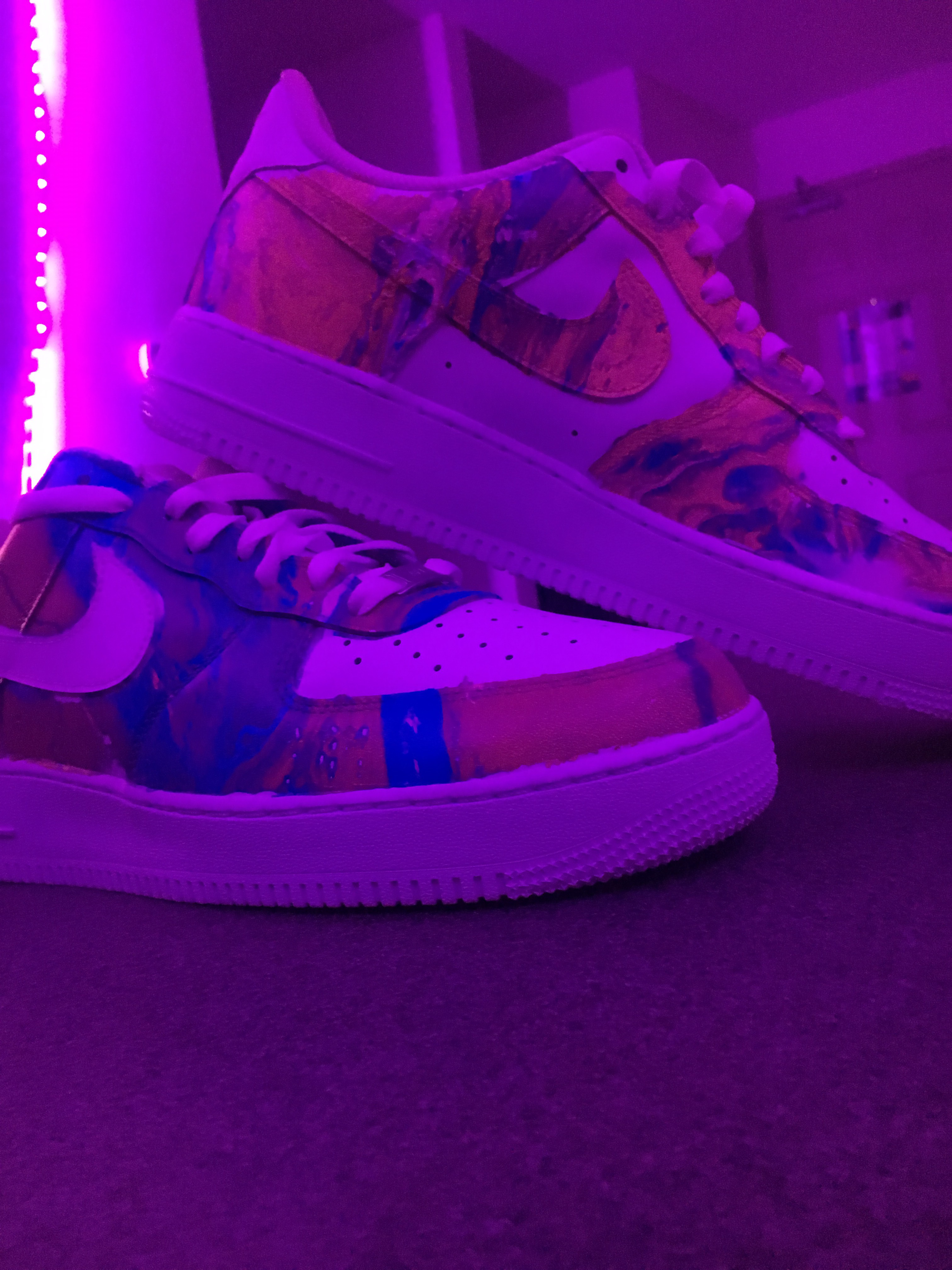
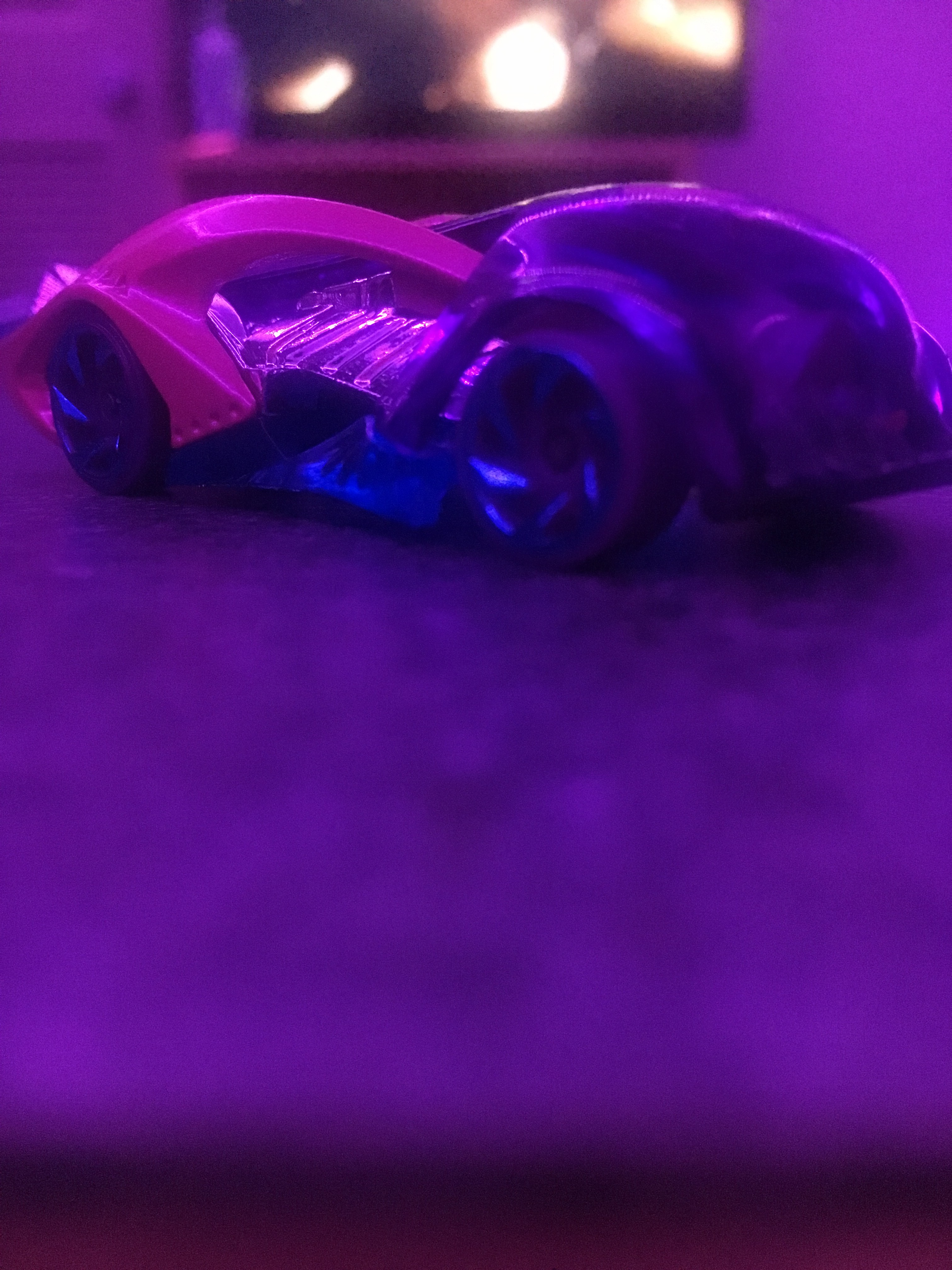
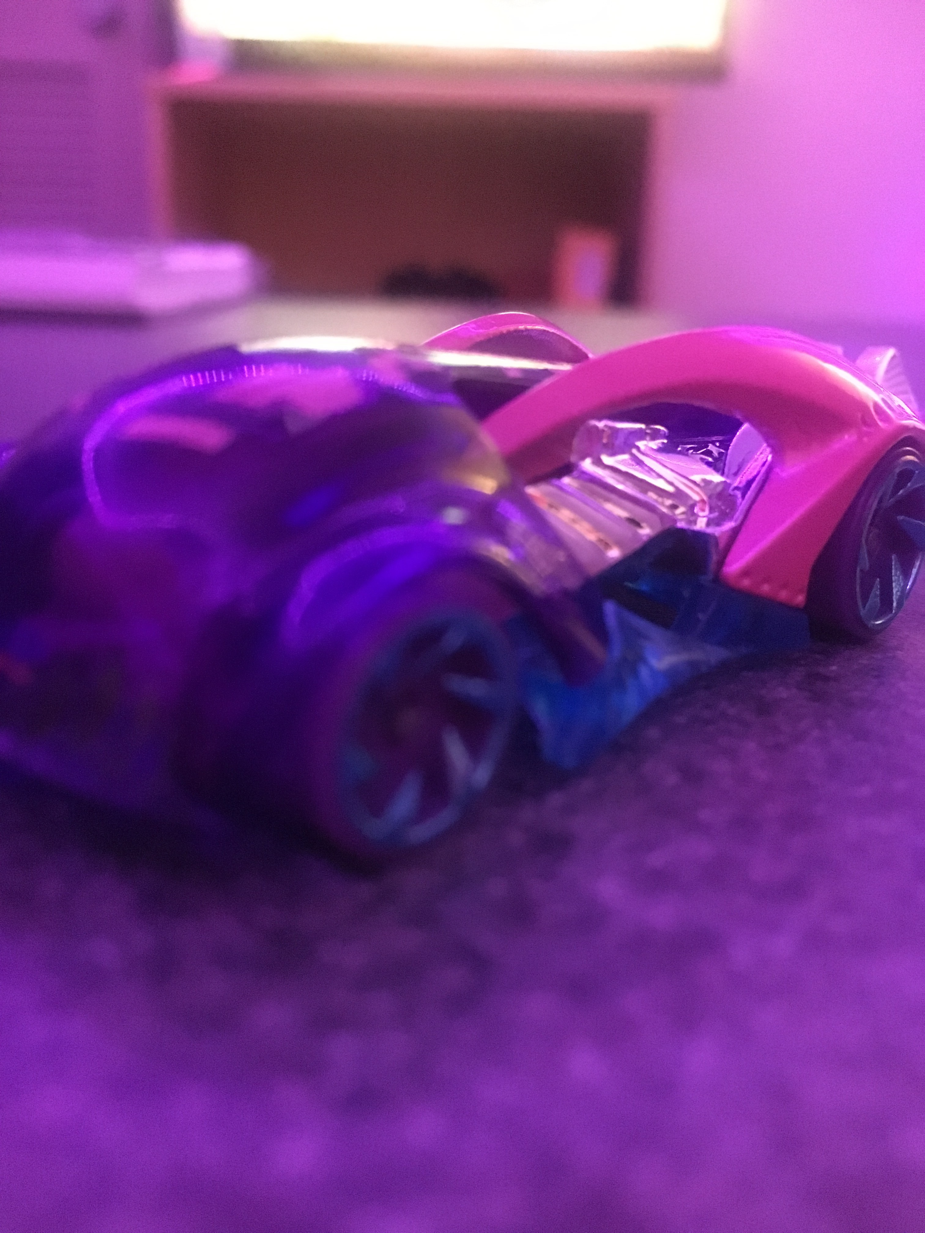
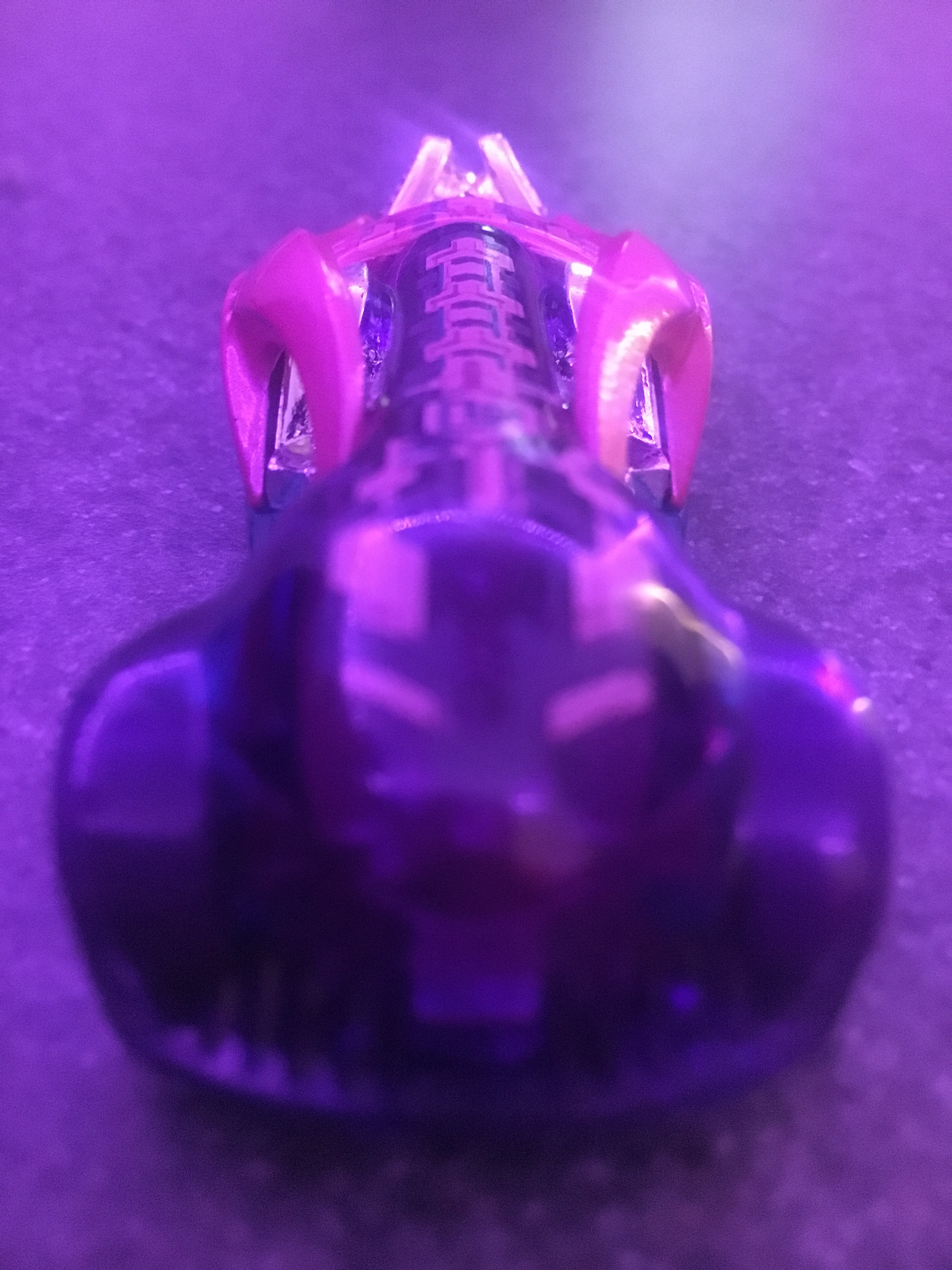
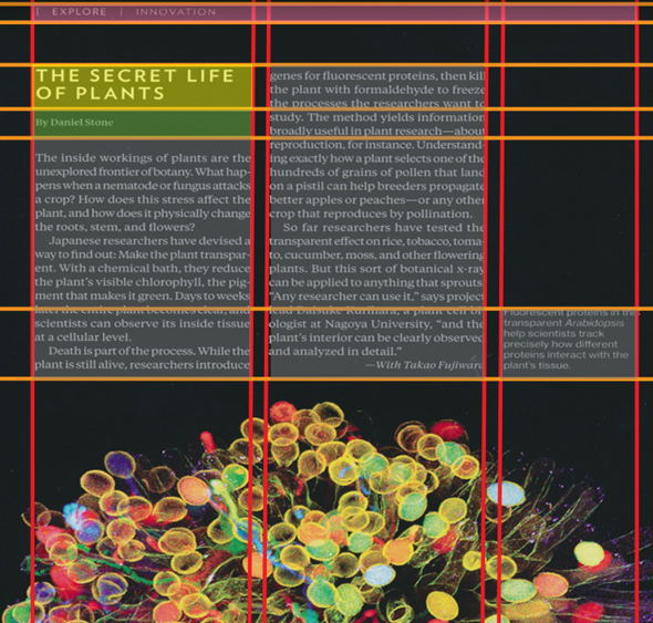
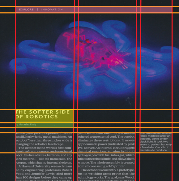
For my first Blog post I decided to include a few of my process pictures for our second in class assignment and some work we have been going through in class that deals with finding the margins and marking them out with three similar pages of content from magazines we chose. For the in class assignment I am currently deciding on what content I should use for the pictures I have to do for my collection. So far I have some ideas that I want to use with the Nike shoes and Hot wheel cars. I plan on taking pictures of them in such a manner that it looks like they were in motion, Since both objects in my collection are typically seen moving or pictured as moving like a car driving or shoes on a persons feet walking. I also want to photograph a variety of different shoes and a variety of different hot wheels. I Also have an idea where I could maybe show the toy cars in real life situations like maybe have them sitting at a stoplight, or maybe lined up for a race, just to add a bit of narrative to the project. I am also very interested in the print design diagram exercise, and I’m excited to see where it goes I really enjoyed seeing how most magazines stay consistent for the most part when it comes to the layout of the page vertically and horizontally. Everything in my magazine which was National geographic was very uniform and stayed very similar in size and style.

